No edit summary |
Encredechine (talk | contribs) (Undo revision 1958 by 87.226.213.86 (talk)) |
||
| (5 intermediate revisions by 3 users not shown) | |||
| Line 195: | Line 195: | ||
:: Heya, sorry for any late replies, but I'm busy again with two new wikis. Well, I'm glad, that you bring issues up. When we spin up a new wiki, we usually add what currently is available and then create a ton of stub pages with some information. I'm actually quite happy with the new main page's face. It's definitely more intersting now. Hmm, what kind of testing environment? In case you don't know, you can create your own custom.css under [[Special:Preferences#mw-prefsection-rendering]]. And there is [[gphelp:Getting started|Help Wiki]], which provides good information. If there is something you'd like to see there, we are always happy, when people make suggestions. You always can experiment with our responsive 2 or 3 column main page layouts. See the two column one here: [https://birthdaysthebeginning.gamepedia.com/Birthdays_the_Beginning_Wiki Birthdays the Beginning Wiki], see the 3 column one there: [https://tower57.gamepedia.com/Tower_57_Wiki Tower 57 Wiki]. [[User:Encredechine|Encredechine]] ([[User talk:Encredechine|talk]]) 22:04, 16 May 2017 (UTC) |
:: Heya, sorry for any late replies, but I'm busy again with two new wikis. Well, I'm glad, that you bring issues up. When we spin up a new wiki, we usually add what currently is available and then create a ton of stub pages with some information. I'm actually quite happy with the new main page's face. It's definitely more intersting now. Hmm, what kind of testing environment? In case you don't know, you can create your own custom.css under [[Special:Preferences#mw-prefsection-rendering]]. And there is [[gphelp:Getting started|Help Wiki]], which provides good information. If there is something you'd like to see there, we are always happy, when people make suggestions. You always can experiment with our responsive 2 or 3 column main page layouts. See the two column one here: [https://birthdaysthebeginning.gamepedia.com/Birthdays_the_Beginning_Wiki Birthdays the Beginning Wiki], see the 3 column one there: [https://tower57.gamepedia.com/Tower_57_Wiki Tower 57 Wiki]. [[User:Encredechine|Encredechine]] ([[User talk:Encredechine|talk]]) 22:04, 16 May 2017 (UTC) |
||
::: Being a web designer, I am not entirely sold on the current look of the home page although it is a great start. At the moment, we don't know a lot about how the game's UI will be structured (In regards to fonts, borders & frames, etc) but I trust as more is revealed that we can all agree it would be nice to migrate closer to that theme. To give an example, the normal font on articles needs to be the default, but certain headers (like those on the main page boxes) will eventually become the in-game font. Now there are exceptions, but the idea is to theme the wiki after the game so that it is immediately obvious that it belongs to that game. Now I quite like things where they are at this stage, but a few changes I suggest are mostly concerning fonts. Arial is a "not-so-attractive" font, and if you would like to improve the boxes on the home page, a better font would be one like "Open Sans" or even "Raleway" if we can import google fonts. And finally, the hover colour on the links is quite average (going from white to grey), maybe it could go from white to orange? I'm super stoaked at what you guys have done so far. This is going to be epic! <div style="border-radius:0px 100px 0px 100px;background:#404040;width:175px;height:22px;text-align:center;">[[UserProfile:Atlas9802|<span style="color:#BBE4F1;">DatAtlas</span>]]║[[User_talk:Atlas9802|<span style="color:#BBE4F1;">Talk</span>]]</div> 00:44, 6 June 2017 (UTC) |
::: Being a web designer, I am not entirely sold on the current look of the home page although it is a great start. At the moment, we don't know a lot about how the game's UI will be structured (In regards to fonts, borders & frames, etc) but I trust as more is revealed that we can all agree it would be nice to migrate closer to that theme. To give an example, the normal font on articles needs to be the default, but certain headers (like those on the main page boxes) will eventually become the in-game font. Now there are exceptions, but the idea is to theme the wiki after the game so that it is immediately obvious that it belongs to that game. Now I quite like things where they are at this stage, but a few changes I suggest are mostly concerning fonts. Arial is a "not-so-attractive" font, and if you would like to improve the boxes on the home page, a better font would be one like "Open Sans" or even "Raleway" if we can import google fonts. And finally, the hover colour on the links is quite average (going from white to grey), maybe it could go from white to orange? I'm super stoaked at what you guys have done so far. This is going to be epic! <div style="border-radius:0px 100px 0px 100px;background:#404040;width:175px;height:22px;text-align:center;">[[UserProfile:Atlas9802|<span style="color:#BBE4F1;">DatAtlas</span>]]║[[User_talk:Atlas9802|<span style="color:#BBE4F1;">Talk</span>]]</div> 00:44, 6 June 2017 (UTC) |
||
| + | :::: The fact about the fonts, borders and other styles would apply to the whole page, not just the start page. We might migrate something closer to the original theme of the game, but with some distinguishing features to separate it from other pages. I think we might be able to use Google fonts, however I'm not familiar with the range of supported devices regarding those. Yeah, we might change the hover color - grey was the easiest to fit all background images ;) [[User:Herdo|Herdo]] ([[User talk:Herdo|talk]]) 13:21, 7 June 2017 (UTC) |
||
| + | :::::Aye, it's unfortunately always so complicated to "design" a wiki, when a game is in an early development stage. Concerning fonts - we have [[Special:FontManager]] and if you like to add a font there, you always can talk with [[User:Alianin]] or send an email to me. The fonts should be free to use and have the appropriate license for our needs. "Open sans" and "Raleway" are already on our font manager site! I'd suggest, you're just going on and see where it will take you, although I think, staying neutral with the design is alright for now. When the game is released, we still can dump the old look and do something completely new. [[User:Encredechine|Encredechine]] ([[User talk:Encredechine|talk]]) 08:52, 8 June 2017 (UTC) |
||
Latest revision as of 11:53, 30 June 2018
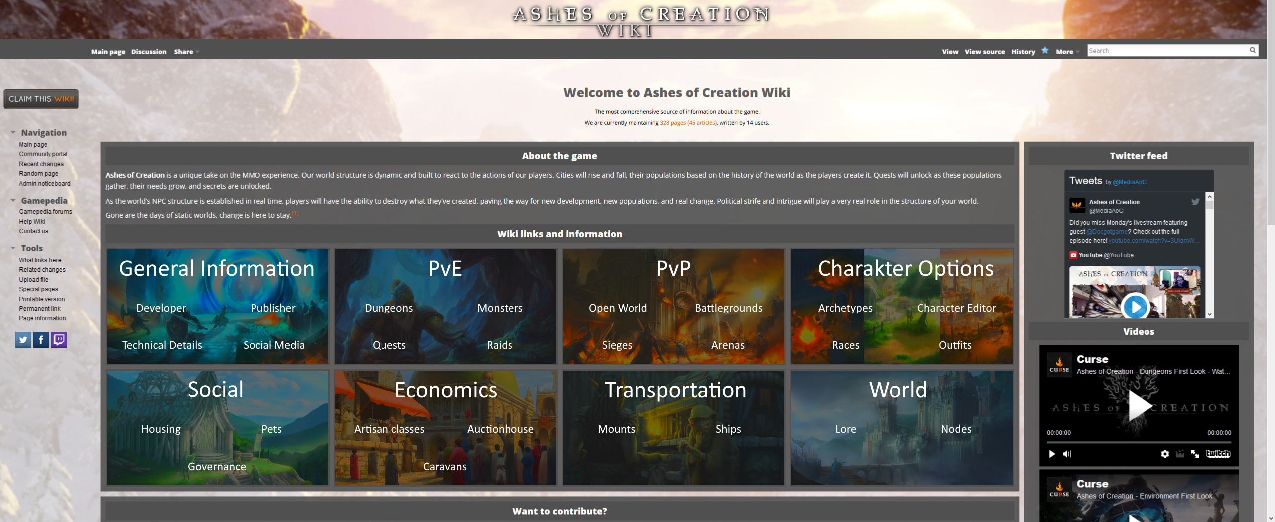
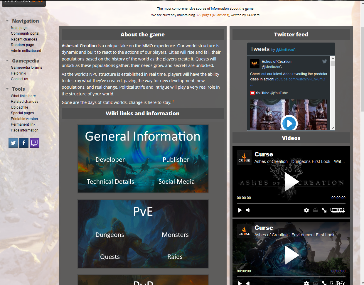
The front page could use some more organizing.
It seems to me like there could be a table or several tables for different areas of the game. PvP, PvE, economic stuff, character options, and other RP stuff. Perhaps a table? I'll put some ideas below. If you got any suggestions feel free to post them. --Trubr (talk) 19:05, 9 May 2017 (UTC)
Table Concept #1 - One big table.
Good for keeping things aligned, but lacks subheaders for subcategories by default.
| PvE | PvP | ||
|---|---|---|---|
| Dungeons | Raids | Caravans | Sieges |
| Node Development | Open World PvP | ||
| RP | |||
| Housing | Small Pets | Mounts | Ships |
| Quests | Lore | The World | |
| Trade Activities | Character Options | ||
| Gathering | Processing | Archetypes | Races |
| Crafting | Trading | Abilities | |
--Trubr (talk) 19:05, 9 May 2017 (UTC)
Table Concept #2 - Embedded tables.
Allows captions to be used as a form of table header, with subcategories as headers. Doesn't work as well with keeping things aligned.
|
| ||||||||||||||||||||||||
| |||||||||||||||||||||||||
--Trubr (talk) 19:05, 9 May 2017 (UTC)
Graphical front page concept
Rather than displaying the tables as plain text tables, I'd like to suggest using some media inside. Some images to visualize the primary topic and the subtopics being listd below. However, this should be made adaptive:
- Display 2 or 3 primary topics side by side, in 2 or 3 rows on normal PCs.
- Display each primary topic beneath the prior primary topic on mobiles.
Example:

Herdo (talk) 16:36, 10 May 2017 (UTC)
- yeah, I kinda like that. Just the green is awful. Encredechine (talk) 16:48, 10 May 2017 (UTC)
- Finding a good color to match that background image is kinda difficult. But AFAIK, we would need some CSS styling to provide background images for tables (and specific cells) Herdo (talk) 18:06, 10 May 2017 (UTC)
- Suggested layout based on (slightly modified) Trubr suggestions:
Herdo (talk) 20:40, 10 May 2017 (UTC)
- It definitely looks better than what we have now with the text all off to one side. However, as a person who generally only has a Wiki page cover half a screen to act as a little game guide, how does it look to people who only cover up half the screen?--Trubr (talk) 02:08, 11 May 2017 (UTC)
- The single groups would wrap, if there's not enough space available. Same mechanic should apply to the mobile version:
Herdo (talk) 14:57, 11 May 2017 (UTC)
Prototype
This is a prototype for the front page. Images would be added later on the real front page.
Applied CSS:
div.front-page-group {
   width: 444px;
   height: 230px;
   float: left;
   margin: 8px;
   background-color: lightblue;
   border:3px solid #505050;
   font-size:24px;
}

table.front-page-table {
   width:100%;
   height:100%;
}

table.front-page-table tr:first-child {
   height: 80px;
}

table.front-page-table td {
   text-align:center;
   vertical-align:middle;
   min-width:222px;
}

table.front-page-table a {
   color:#FFFFFF !important; /* Need to do this in order to prevent the color being changed by the wiki engine for existing and non-existing pages */
}

table.front-page-table a:hover {
   color:#EEEEEE !important; /* Need to do this in order to prevent the color being changed by the wiki engine for existing and non-existing pages */
}

table.front-page-table th a {
   font-size:32px;
}
Example is displayed between these lines - enter edit mode and remove the display:none;). The example is hidden to not influence the rest of the discussion page.
______________________________
______________________________
Herdo (talk) 19:15, 11 May 2017 (UTC)
- The mobile style seems to be different from the Hydra style. The style should therefore be applied to the common.css Herdo (talk) 19:22, 11 May 2017 (UTC)
Redoing the main page and styles
Heya, I just want to make it clear, that I'm not married to this current look of the site. But before you do bigger changes - please test it in a personal css and create an editcopy of the main page. Thank you! Encredechine (talk) 16:52, 10 May 2017 (UTC)
- Prior to that, a design discussion should be completed with a full, and final, layout of the front page. We may then start to modify it in a test environment. Herdo (talk) 18:10, 10 May 2017 (UTC)
- Just to be clear, I don't have permissions to edit the front page and I wouldn't even like to have such permissions. I'm not an experienced contributor myself and feel like the front page is more for advanced users. I just really don't like the lack of categorization on the front page. The Kickstarter for Ashes of Creation brought forth some new information and people seeking such information. Thought I'd start the talk page to lay down an idea and a means to discuss what I see as an issue. By the way, know any good beginner guides on testing creating and using test environments? --Trubr (talk) 20:06, 10 May 2017 (UTC)
- Heya, sorry for any late replies, but I'm busy again with two new wikis. Well, I'm glad, that you bring issues up. When we spin up a new wiki, we usually add what currently is available and then create a ton of stub pages with some information. I'm actually quite happy with the new main page's face. It's definitely more intersting now. Hmm, what kind of testing environment? In case you don't know, you can create your own custom.css under Special:Preferences#mw-prefsection-rendering. And there is Help Wiki, which provides good information. If there is something you'd like to see there, we are always happy, when people make suggestions. You always can experiment with our responsive 2 or 3 column main page layouts. See the two column one here: Birthdays the Beginning Wiki, see the 3 column one there: Tower 57 Wiki. Encredechine (talk) 22:04, 16 May 2017 (UTC)
- Being a web designer, I am not entirely sold on the current look of the home page although it is a great start. At the moment, we don't know a lot about how the game's UI will be structured (In regards to fonts, borders & frames, etc) but I trust as more is revealed that we can all agree it would be nice to migrate closer to that theme. To give an example, the normal font on articles needs to be the default, but certain headers (like those on the main page boxes) will eventually become the in-game font. Now there are exceptions, but the idea is to theme the wiki after the game so that it is immediately obvious that it belongs to that game. Now I quite like things where they are at this stage, but a few changes I suggest are mostly concerning fonts. Arial is a "not-so-attractive" font, and if you would like to improve the boxes on the home page, a better font would be one like "Open Sans" or even "Raleway" if we can import google fonts. And finally, the hover colour on the links is quite average (going from white to grey), maybe it could go from white to orange? I'm super stoaked at what you guys have done so far. This is going to be epic! DatAtlas║Talk00:44, 6 June 2017 (UTC)
- The fact about the fonts, borders and other styles would apply to the whole page, not just the start page. We might migrate something closer to the original theme of the game, but with some distinguishing features to separate it from other pages. I think we might be able to use Google fonts, however I'm not familiar with the range of supported devices regarding those. Yeah, we might change the hover color - grey was the easiest to fit all background images ;) Herdo (talk) 13:21, 7 June 2017 (UTC)
- Aye, it's unfortunately always so complicated to "design" a wiki, when a game is in an early development stage. Concerning fonts - we have Special:FontManager and if you like to add a font there, you always can talk with User:Alianin or send an email to me. The fonts should be free to use and have the appropriate license for our needs. "Open sans" and "Raleway" are already on our font manager site! I'd suggest, you're just going on and see where it will take you, although I think, staying neutral with the design is alright for now. When the game is released, we still can dump the old look and do something completely new. Encredechine (talk) 08:52, 8 June 2017 (UTC)
- The fact about the fonts, borders and other styles would apply to the whole page, not just the start page. We might migrate something closer to the original theme of the game, but with some distinguishing features to separate it from other pages. I think we might be able to use Google fonts, however I'm not familiar with the range of supported devices regarding those. Yeah, we might change the hover color - grey was the easiest to fit all background images ;) Herdo (talk) 13:21, 7 June 2017 (UTC)
- Being a web designer, I am not entirely sold on the current look of the home page although it is a great start. At the moment, we don't know a lot about how the game's UI will be structured (In regards to fonts, borders & frames, etc) but I trust as more is revealed that we can all agree it would be nice to migrate closer to that theme. To give an example, the normal font on articles needs to be the default, but certain headers (like those on the main page boxes) will eventually become the in-game font. Now there are exceptions, but the idea is to theme the wiki after the game so that it is immediately obvious that it belongs to that game. Now I quite like things where they are at this stage, but a few changes I suggest are mostly concerning fonts. Arial is a "not-so-attractive" font, and if you would like to improve the boxes on the home page, a better font would be one like "Open Sans" or even "Raleway" if we can import google fonts. And finally, the hover colour on the links is quite average (going from white to grey), maybe it could go from white to orange? I'm super stoaked at what you guys have done so far. This is going to be epic!
- Heya, sorry for any late replies, but I'm busy again with two new wikis. Well, I'm glad, that you bring issues up. When we spin up a new wiki, we usually add what currently is available and then create a ton of stub pages with some information. I'm actually quite happy with the new main page's face. It's definitely more intersting now. Hmm, what kind of testing environment? In case you don't know, you can create your own custom.css under Special:Preferences#mw-prefsection-rendering. And there is Help Wiki, which provides good information. If there is something you'd like to see there, we are always happy, when people make suggestions. You always can experiment with our responsive 2 or 3 column main page layouts. See the two column one here: Birthdays the Beginning Wiki, see the 3 column one there: Tower 57 Wiki. Encredechine (talk) 22:04, 16 May 2017 (UTC)